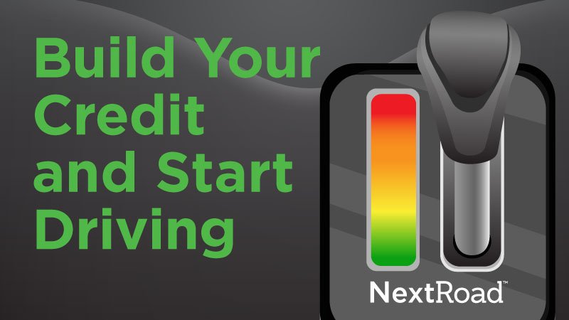
NextRoad
NextRoad Case Study // NextRoad is a new identity for OpenRoad Auto Group’s specialty finance initiative. It offers non-prime loans a financial service to help car buyers who face credit challenges with traditional banks. NextRoad is OpenRoad Auto Group’s new company and next step to finance your car.

Situation & Opportunity
The NextRoad is a new sub-company of OpenRoad Auto Group that offers non-prime loans and financial services to help car buyers who face credit challenges with traditional banks.
In this project, I was assigned to build a consistent visual identity through creative assets like email templates, social ads, a website with messaging that aligns with the current OpenRoad Auto Group branding. This is to create familiarity and target existing OpenRoad Auto Group consumers.


Research & Strategy
The first step to starting this project is to analyze the different personas OpenRoad Auto Group customers. I also research the competition and what makes them successful. We also looked into the buying and financing process of consumers. These reports helped me understand the credit approval process with financial helpers and banks.
As I looked over colour choices, we looked over the current market and banks as NextRoad circles around credit approval. The colour green has a positive association with nature, money and security. Green is a colour of optimism and a symbol of a fresh start, growth and wealth. The word “green” is associated with many positive phrases such as “green means go,” “we’re going green,” “the green room.”
With the large market of used cars and other dealerships in Canada, I noticed a stagnant level of creativity with social ads. Therefore, there was a clear opportunity to create a design that is universally pleasing to any gender at any age, imagery, illustrations and gifs.


Solution & Outcomes
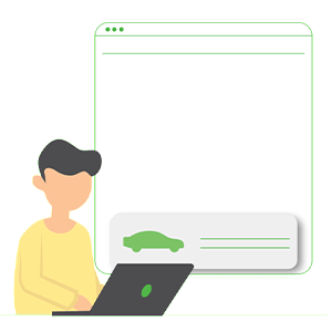
From my research, I first create a wireframe of the website and placed information in a similar order as how a consumer would experience in a bank or in the dealership. As to avoid an overflow of information, I split up the website into categories and giving visual breaks with gifs, illustrations and icons. I created a form that is easy to navigate with icons, sliders, and numbered steps. In initial tests, we find that people feel more relieved to see numbered forms and are more likely to complete the form towards the end. With the website set, I translated it onto mobile as I found majority of the target market frequently use mobile or ipads.
Now with the completion of the website. I began developing items to support the brand such as social ads, business cards, uniforms, car plate frames. As the company and board of directors are pushing to quickly launch the brand, it is important for us to have in-store assets and digital assets ready for opening.