Wild Wok Outdoor Fine Dining
Rebrand Case Study // A kickstarter company based in Canada that focuses on gourmet inspired dehydrated Asian meals for the avid adventurer
Situation & Opportunity
This was a semester-long project in my fourth year of the Graphic Design for Marketing program at the Wilson School of Design. We were tasked to select an existing company that requires a rebrand to help them communicate more successfully to their target audience. Moreover, the rebrand was also realistic in our approach, acting as if it was a real-life project. For my project, I decided to rebrand a Kickstarter company, Wild Wok, to help them express how they are redefining and reinventing dehydrated meals.
Research & Strategy
In my research for this project, I had to analyze Wild Wok’s data on dehydrated meals and how their meals are made. Through this, I was able to get information that would contribute to the success of this project. Some key insights that helped drive the direction of this project are focusing on a specific target audience and centralizing their unique selling proposition and values to produce a visual identity and marketing pieces.
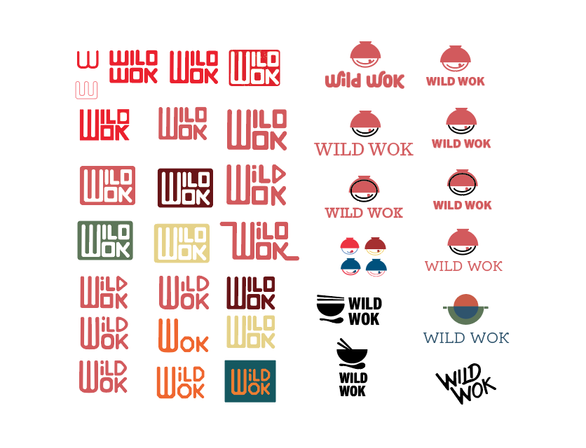
Wild Wok’s current mark needed an upgrade as its current mark does not represent its offer, and the brand was overshadowed by its competitors. Also, their packaging did not resemble the exciting flavour that Asian meals represent as their current packaging uses environmental images and some text. Overall, the goal for the rebrand is to strengthen their relationship with their target audience and to represent the company’s values by creating a visual identity and packaging.


Solution & Outcomes
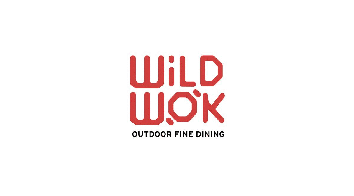
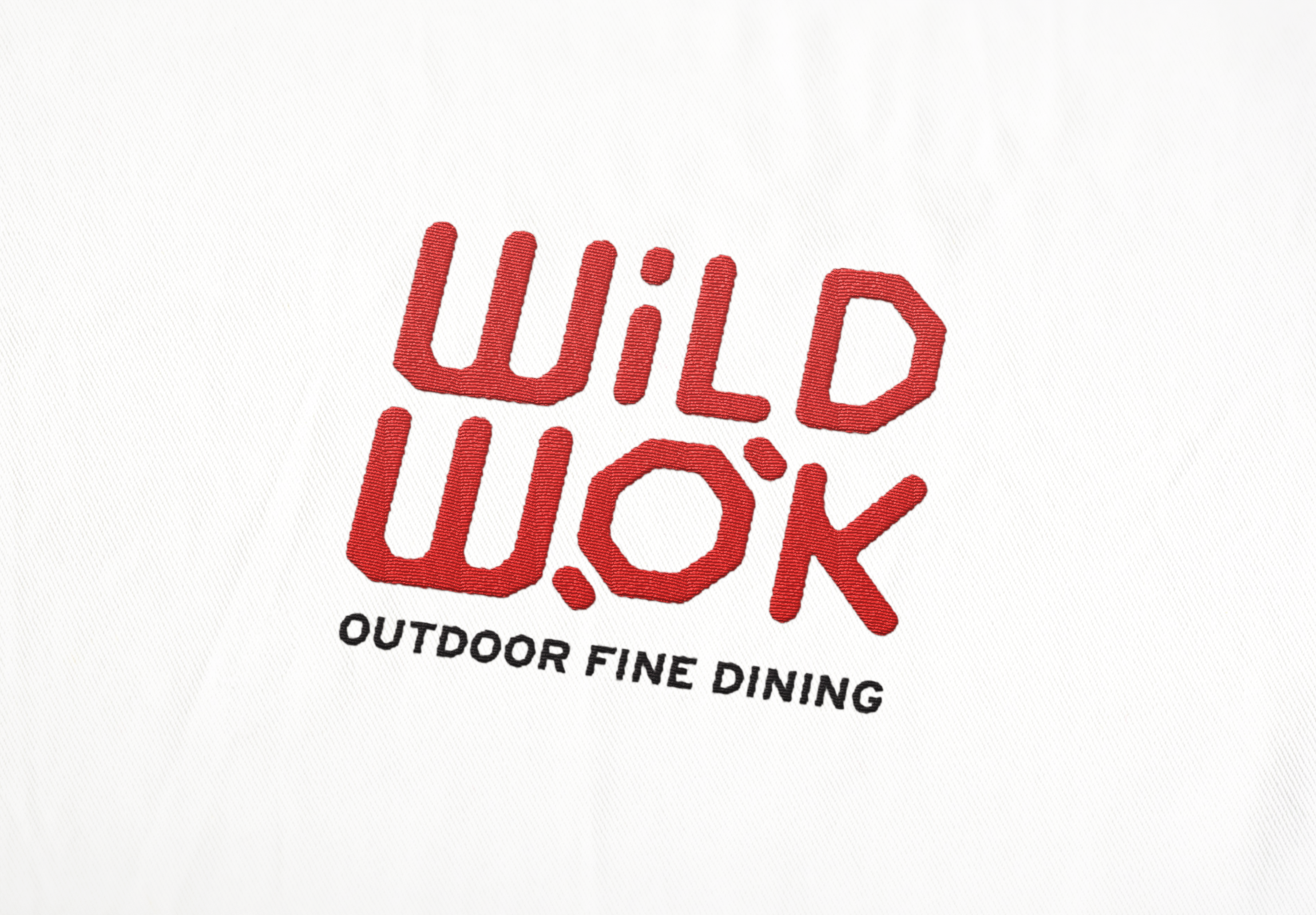
The inspiration of the design solution is influenced by Asian traditional characters and patterns but manipulated to create fresh and unique branding. The logo is inspired by classic Chinese stamps to provide Wild Wok with a unique visual identity.
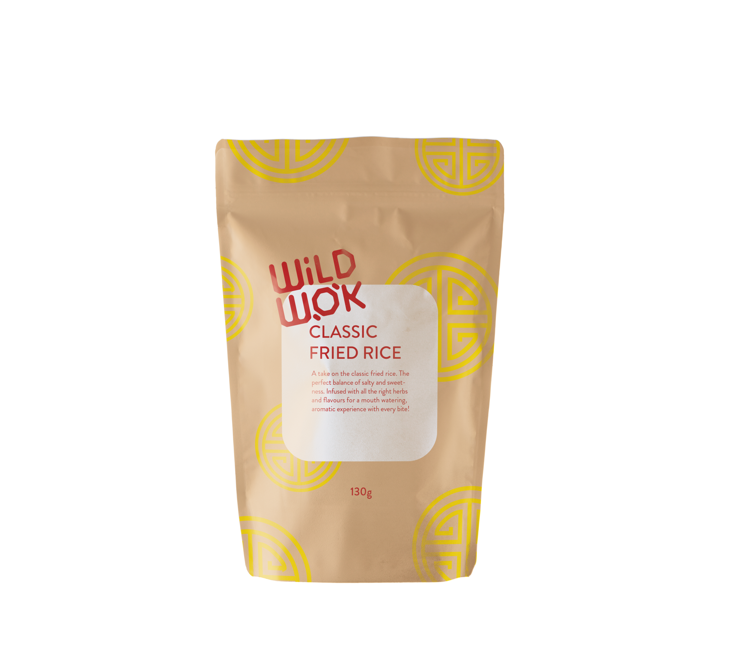
To market the newfound visual identity, there were a few components that I considered adding to the marketing. First of which was the packaging design of the meal packages. With the Asian influences use as a theme, I looked into traditional patterns that are commonly found in the correlating ethnicity of the meal packet.

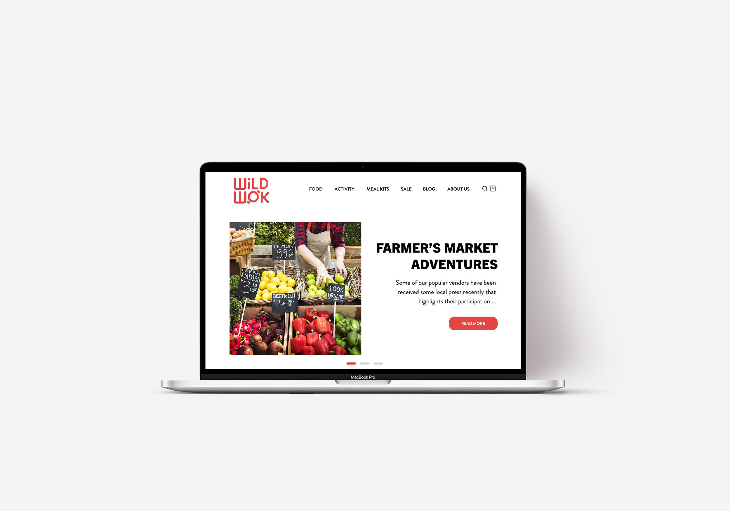

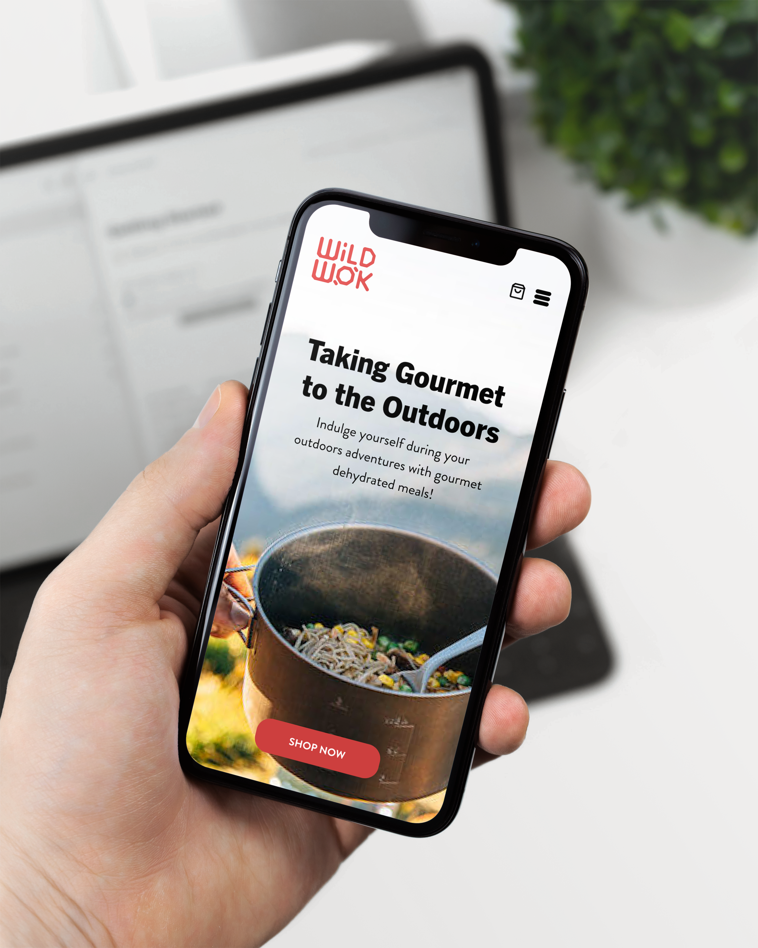
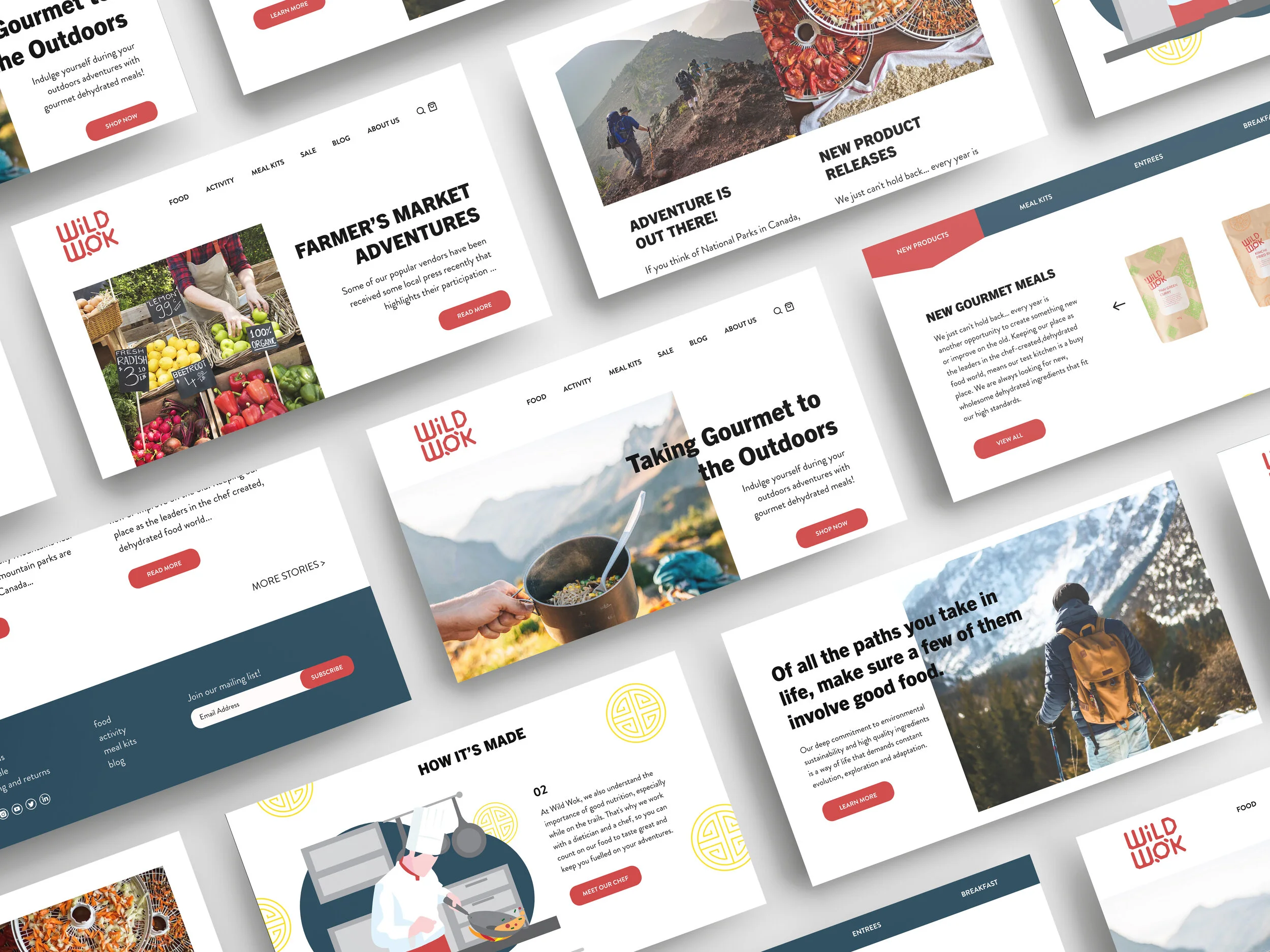
Another component that plays an important role in marketing and introduction the brand is the website. On the homepage, I wanted to clarify what Wild Wok stands for by making the mission and values the focal point. By combining these elements with a vibrant color pattern and the use of images, enables Wild Wok to have a more fresh and friendlier appearance.
In the blog section, the goal is to enable customers to read and interact with the stories of hikers and the producers. Another goal of the blog portion is to connect and empower avid adventurers to enjoy the outdoors. Moreover, with curated environmental post, Wild Wok can show how they are taking part on the preservation of the planet.


Resolution
Overall, rebranding Wild Wok proved to be one of the more challenging projects I have taken on. This project was an opportunity to develop my skills in creating a visual identity that would represent a very unique brand needs to showcase their different qualities. If more time was allotted to this project, I would like to conduct more research and user testing with the targeted audience.